| Name | | Description
|
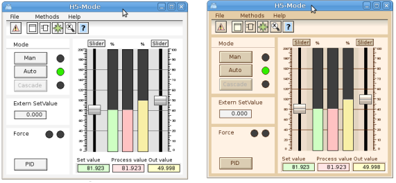
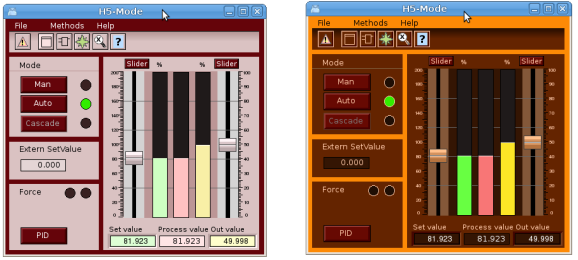
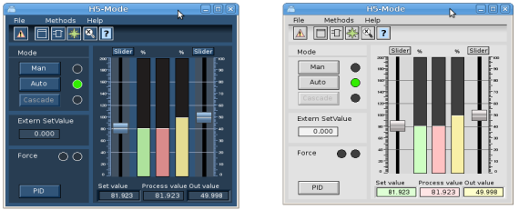
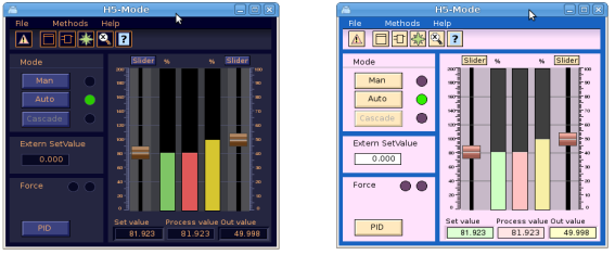
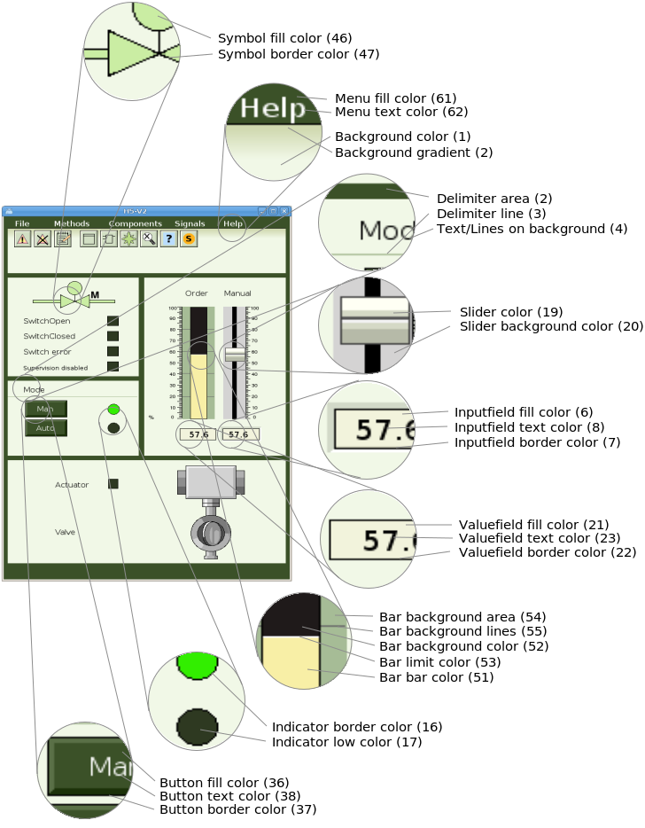
| 1 Background | | Should be set as background color for the graph. Light
|
| | | green in the example above.
|
| 2 Background gradient | | Can be used for gradients to the background color,
|
| | | eg the gradient under the menu above.
|
| 3 Delimiter area | | Color of delimiter areas. The dark green areas.
|
| 4 Delimiter lines | | Color of lines that divides the background, eg the line
|
| | | under Mode above.
|
| 5 Text/Lines on background | | Color of texts and lines on the background.
|
| 6 Input field fill color | | Fill color for ValueInput objects.
|
| 7 Input field border color | | Border color for ValueInput objects.
|
| 8 Input field text color | | Text color for ValueInput objects.
|
|
|
|
|
| 16 Indicator border color | | Should be set as border color on indicators.
|
| 17 Indicator low color | | Low color for indicator
|
| 18 Indicator on delimiter low color | | Low color for an indicator on a delimiter area.
|
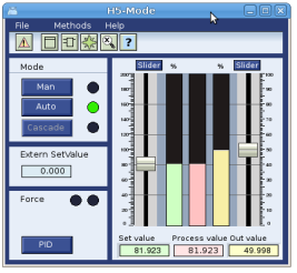
| 19 Slider color | | Color for sliders.
|
| 20 Slider background color | | Color for slider background.
|
| 21 Value field fill color | | Fill color for Value objects.
|
| 22 Value field border color | | Border color for Value objects.
|
| 23 Value field text color | | Text color for Value objects.
|
|
|
| 31 Limit switch high color | | Color for limit switch when it's high.
|
| 32 Limit switch low color | | Color for limit switch when it's low.
|
| 33 Limit switch border color | | Color for limit switch border.
|
| 34 Text/Lines on delimiter | | Color for text or lines on a delimiter area.
|
| 35 Button active color | | Color to indicate that a button is active.
|
| 36 Button fill color | | Fill color for buttons.
|
| 37 Button border color | | Border color for buttons
|
| 38 Button text color | | Text color for buttons
|
| 39 Button insensitive text color | | Text color set when button is set insensitive
|
| | | by Invisible dynamics.
|
| 40 Button insensitive border color | | Border color when button is set insensitive
|
| | | by Invisible dynamics.
|
|
|
| 46 Symbol fill color | | Color that can be used component symbols.
|
| 47 Symbol border color | | Color for symbol border.
|
| 48 Symbol low color | | Color when symbols is low.
|
| 49 Symbol empty color | | Color that can be used to indicate that a valve in closed
|
| | | or empty.
|
50 -
| 51 Bar bar color | | Color for the value part of a bar object.
|
| 52 Bar background color | | Color for background part of a bar object.
|
| 53 Bar bar limit color | | Color for edge of bar.
|
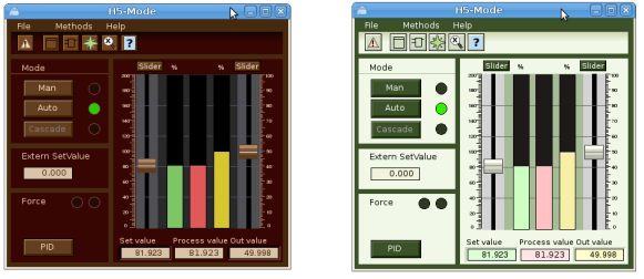
| 54 Bar background area | | Color used for surrounding area for bar objects.
|
| | | Dark green in the example above.
|
| 55 Bar background lines | | Color for lines on the surrounding area for bar
|
| | | objects.
|
|
|
| 61 Menu fill color | | Fill color for menu bars and menus.
|
| 62 Menu text color | | Color for menu texts.
|
| 63 Toolbar fill color | | Color for method toolbar in object graphs
|
| 64 Toolbar border color | | Border color for method toolbar.
|
| 65 Toolbar text color | | Text color for method toolbar.
|
| 66 Diagram fill color | | Fill color for diagrams.
|
| 67 Diagram border color | | Border color for diagrams.
|
| 68 Diagram curve color | | Default curve color for diagram.
|
| 69 Axis border color | | Color for axis objects.
|
|
|