Table


A table object displays a table with a number of rows and columns. Each column is connected
to an array attribute in the database, and the values of the array elements are displayed
in the column.

A cell in the table is selected by clicking on it, or by the arrow keys (if action type
InputFocus is configured for the table). To each column you can connect a select attribute,
i.e. an array attribute in the database of type Boolean. When a cell is selected, the
corresponding element in the select attribute is set, and the previous selected is reset.

If the connected array attribute to a column is of type Objid, you can open a popup menu with
the methods of the objects displayed in the column.

The array attributes should be stated with data type and size, for example
VWX-P1-Table.TabVect##Float32#100, where Float32 is the datatype and 100 the number of elements
in the array.

The table object consists of the following components:
- Vertical and horizontal scrollbar.
- A header row with a title for each column. The header row is not comprised by the vertical
scrollbar.
- A header column. The left most column can be configured as a header column, i.e. it is not
comprised by the horizontal scrollbar.

Limitations

A table object grapbs all events inside the table area, and click sensitive objects can
not be placed on top of the table. If the table temporary should be covered by sensitive
objects, the xtt command 'set subevents' can be used to disable the table event handling.

Attributes

Attribute                           Description
Table.Rows                            Number of rows in the table (header row excluded).
Table.Columns                           Number of columns in the table (header column included).
Table.HeaderRow                         A header row with title for each column is drawn.
Table.HeaderColumn                       The leftmost column is not comprised by the horizontal
                         scrollbar.
Table.RowHeight                        Row height.
Table.HeaderTextSize                       Text size of the text in the header row.
Table.HeaderTextBold                       Bold text in the header row.
Table.HeaderTextColor                       Text color in the header row.
Table.Options                         Bitmask with options
                        1: If the cell in the leftmost column is empty, all the
                        cells on that row is drawn empty.
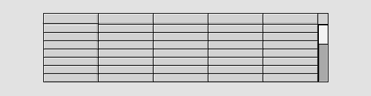
Table.VerticalScrollbar                       Vertical scrollbar in the table.
Table.HorizontalScrollbar                       Horizontal scrollbar in the table.
Table.ScrollbarWidth                       Scrollbar width.
Table.ScrollbarColor                       Fill color of the mobile part of the scrollbar.
Table.ScrollbarBgColor                       Fill color of the background part of the scrollbar.
Column1.Attribute                       Array attribute. The value of each element is displayed
                      in the corresponding row in the column. The attribute
                      should be stated with data type and size, see above.
Column1.Format                       Format in c syntax.
Column1.SelectAttribute                       Array attribute of type Boolean, When a cell in the
                      column is selected, the corresponding element in the
                      array is set. The attribute should be stated with data type
                      and size, see above.
Column1.Width                       Width of the column.
Column1.HeaderText                       Column title. The title is written in the header row.